

Client
Tools
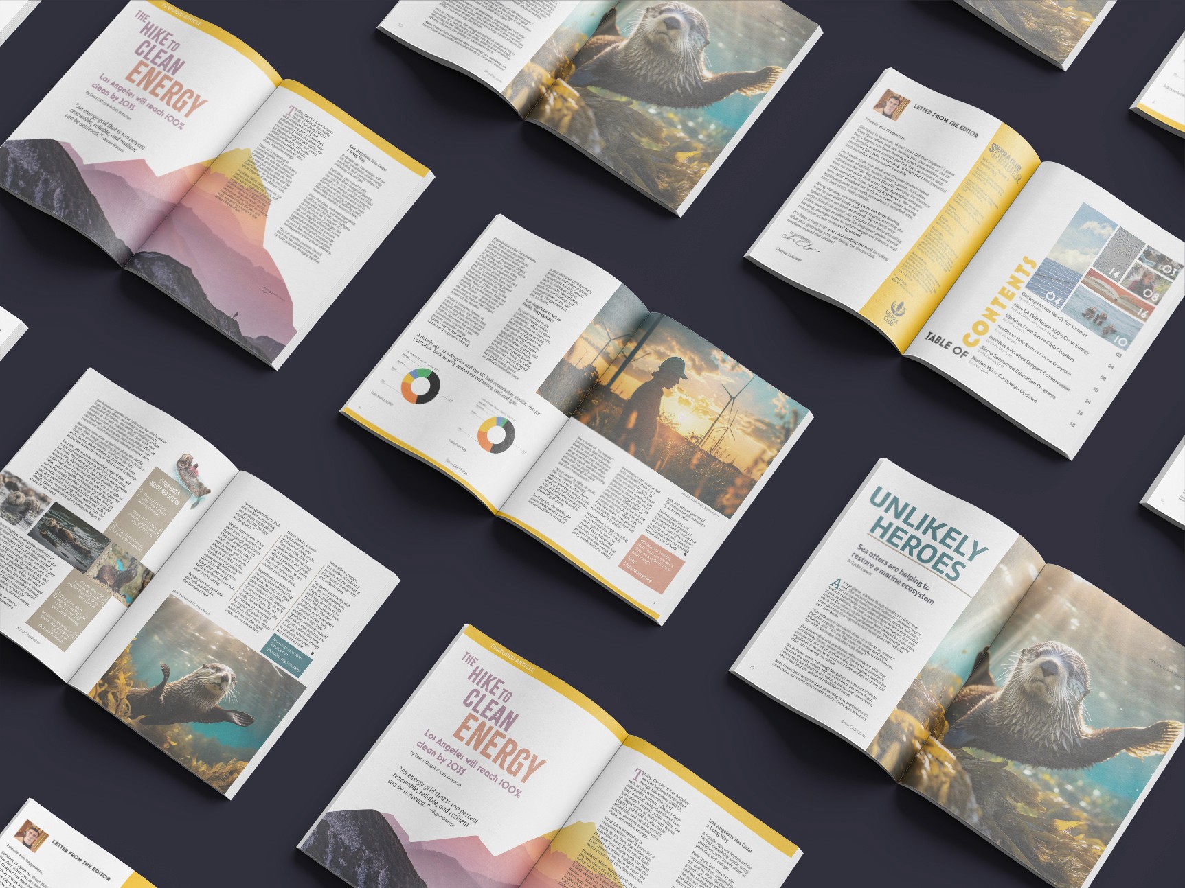
This concept design focused on building a comprehensive cover and spread system for the Sierra Club Insider newsletter, elevating it from a bi-weekly email into a quarterly print publication. This project adhered to Sierra Club's brand guidelines and remained within the aesthetic of other official publications, like that of the Bay Area Chapter's Yodeler magazine. The end result is a vibrant and colorful publication that will have it's club members eager for each issue.
Currently, the Insider is a HTML newsletter sent out bi-weekly to club members. The format is based on a 2 column grid and features a basic combination of images and text. As an email, it is effective and simple. For a magazine, we will expand this basic format into a more dynamic and comprehensive design.

The Sierra Club explains itself as a grassroots environmental organization based in the United States, with many local chapters. Their goal is to amplify the power of their millions of members and supports to help defend everyone's right to a healthy world. An official magazine would need to reflect this love of the environment, down-to-earth nature, and vibrancy of it's diverse members and coverage of issues. The goal is to provide a platform for communicating important issues, campaigns, and events while engaging the reader with beautiful illustrations and photography.
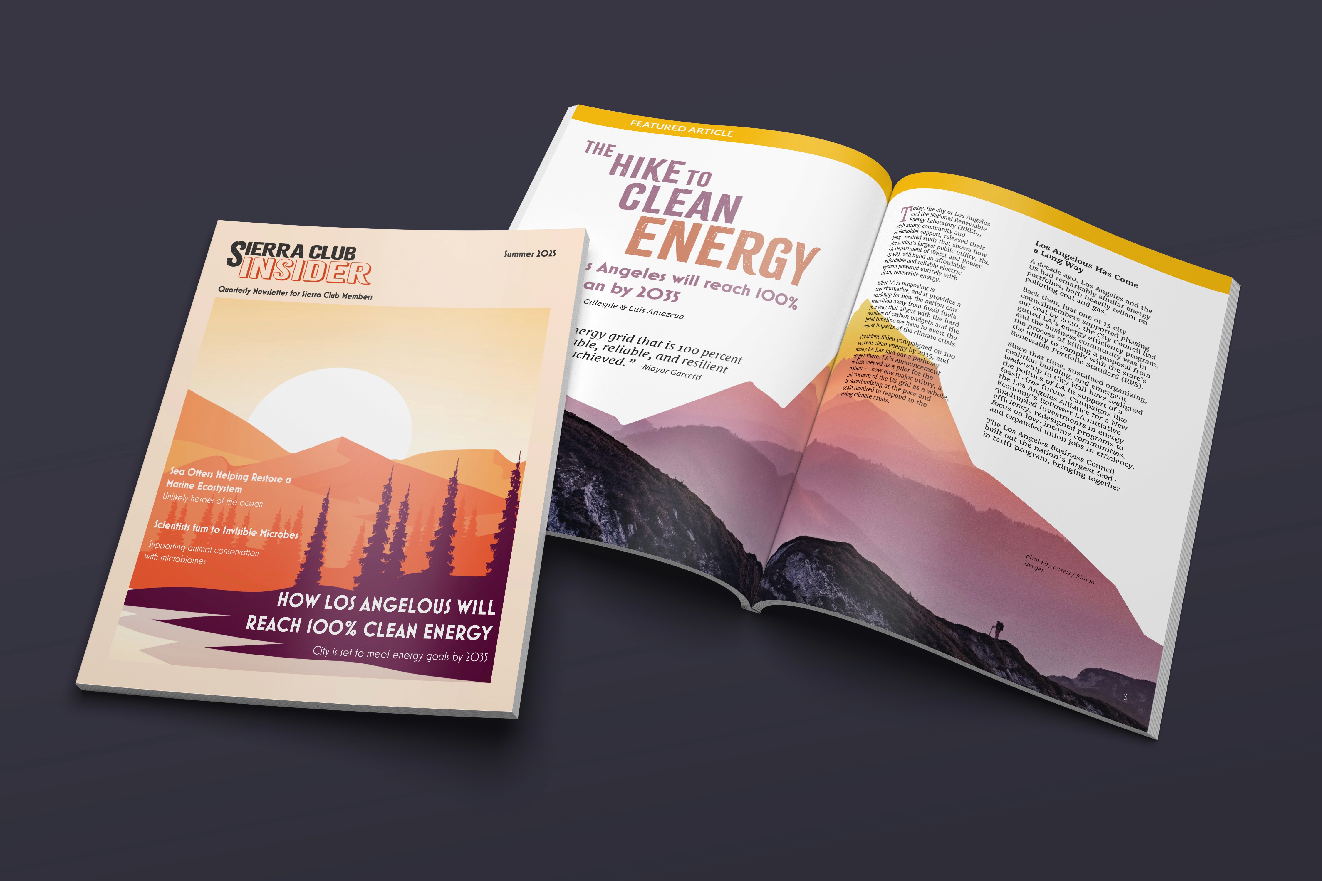
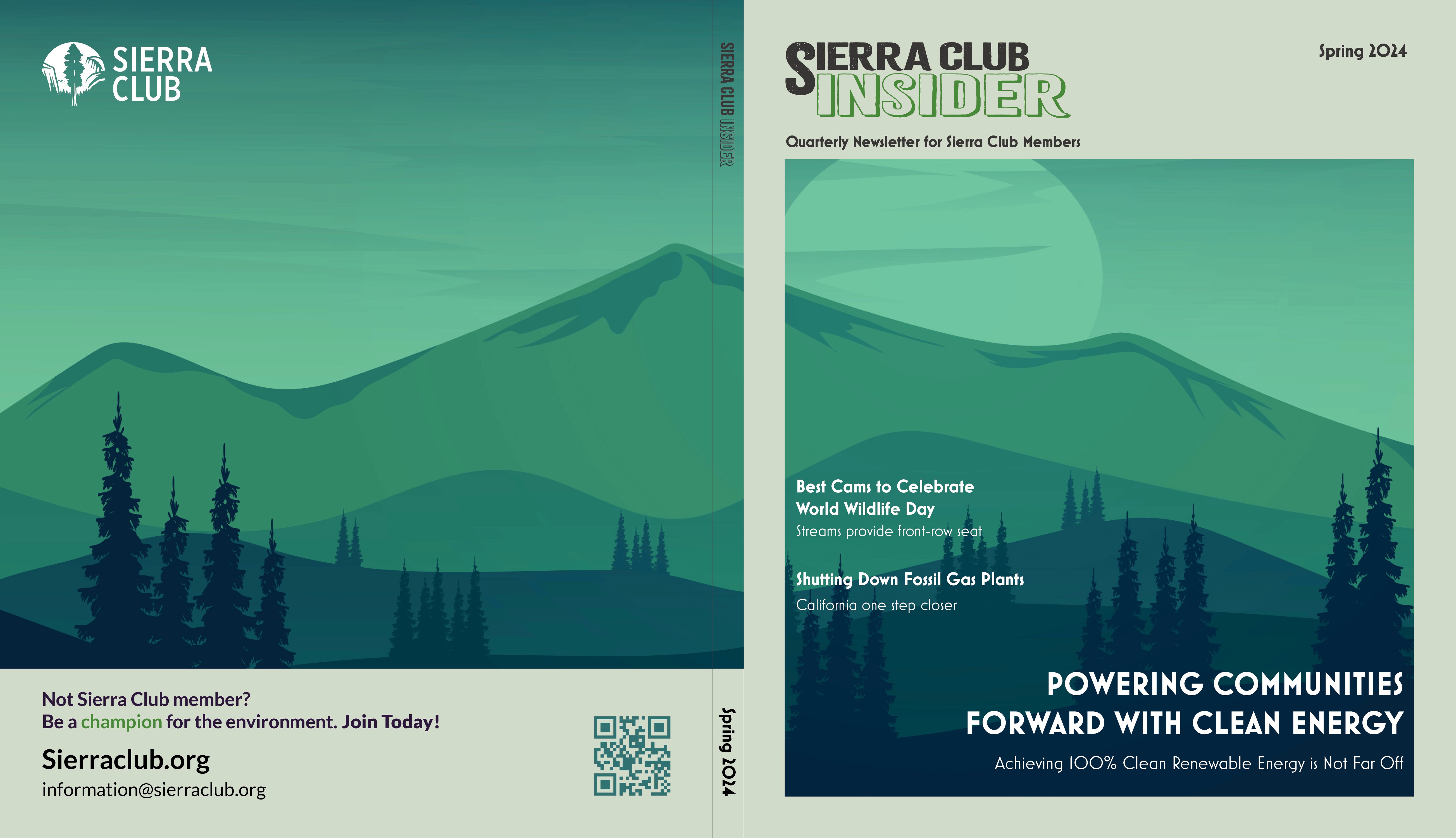
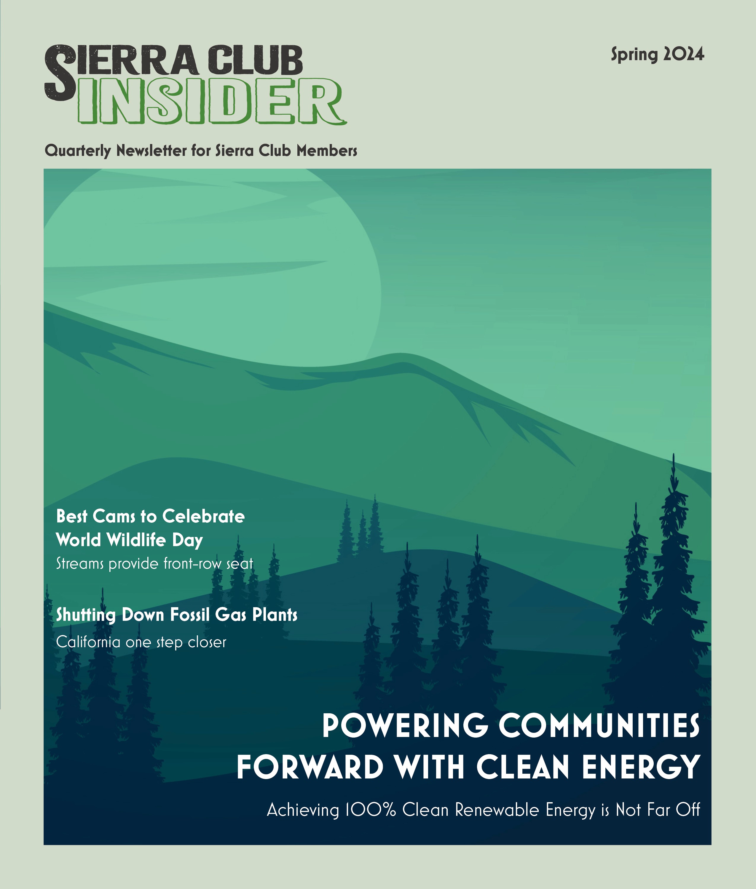
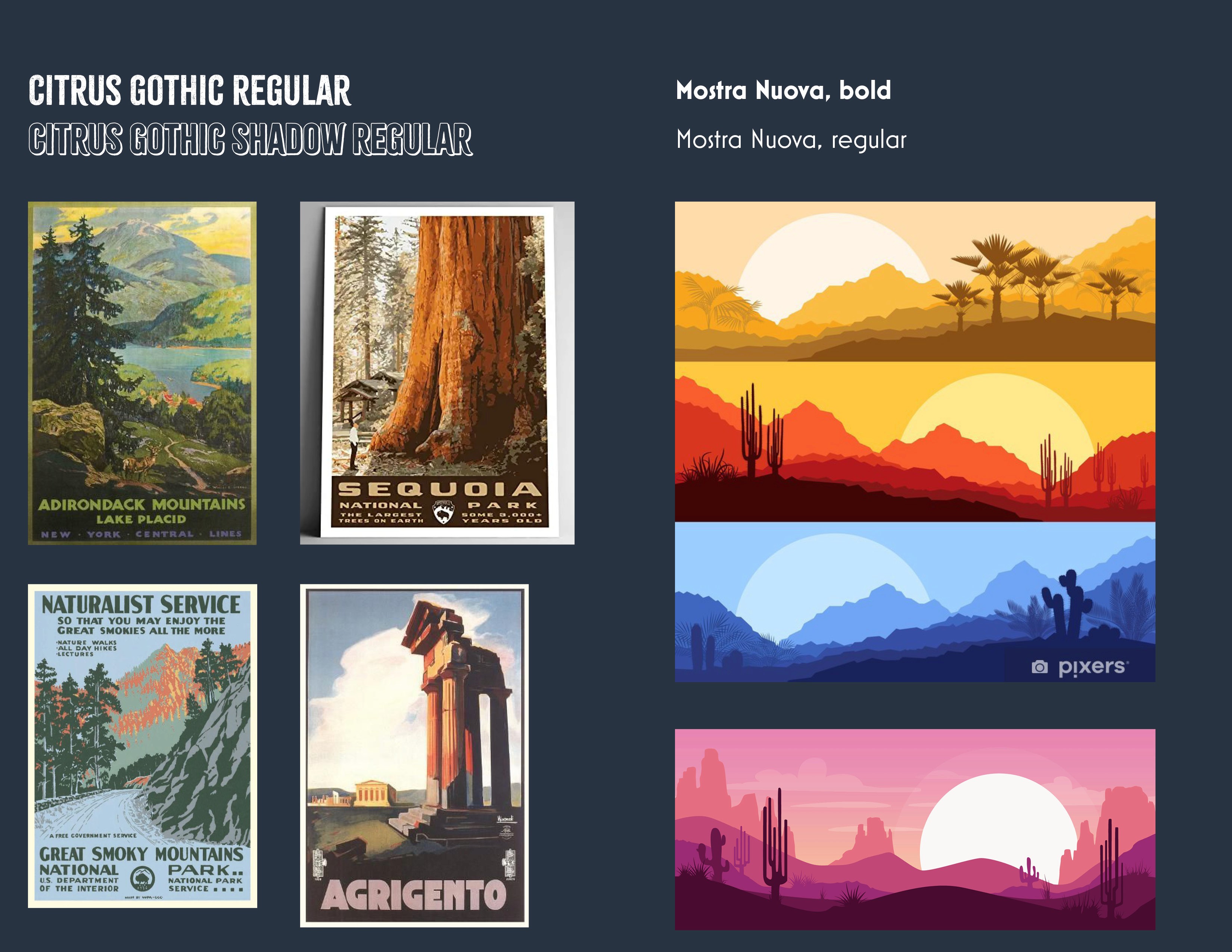
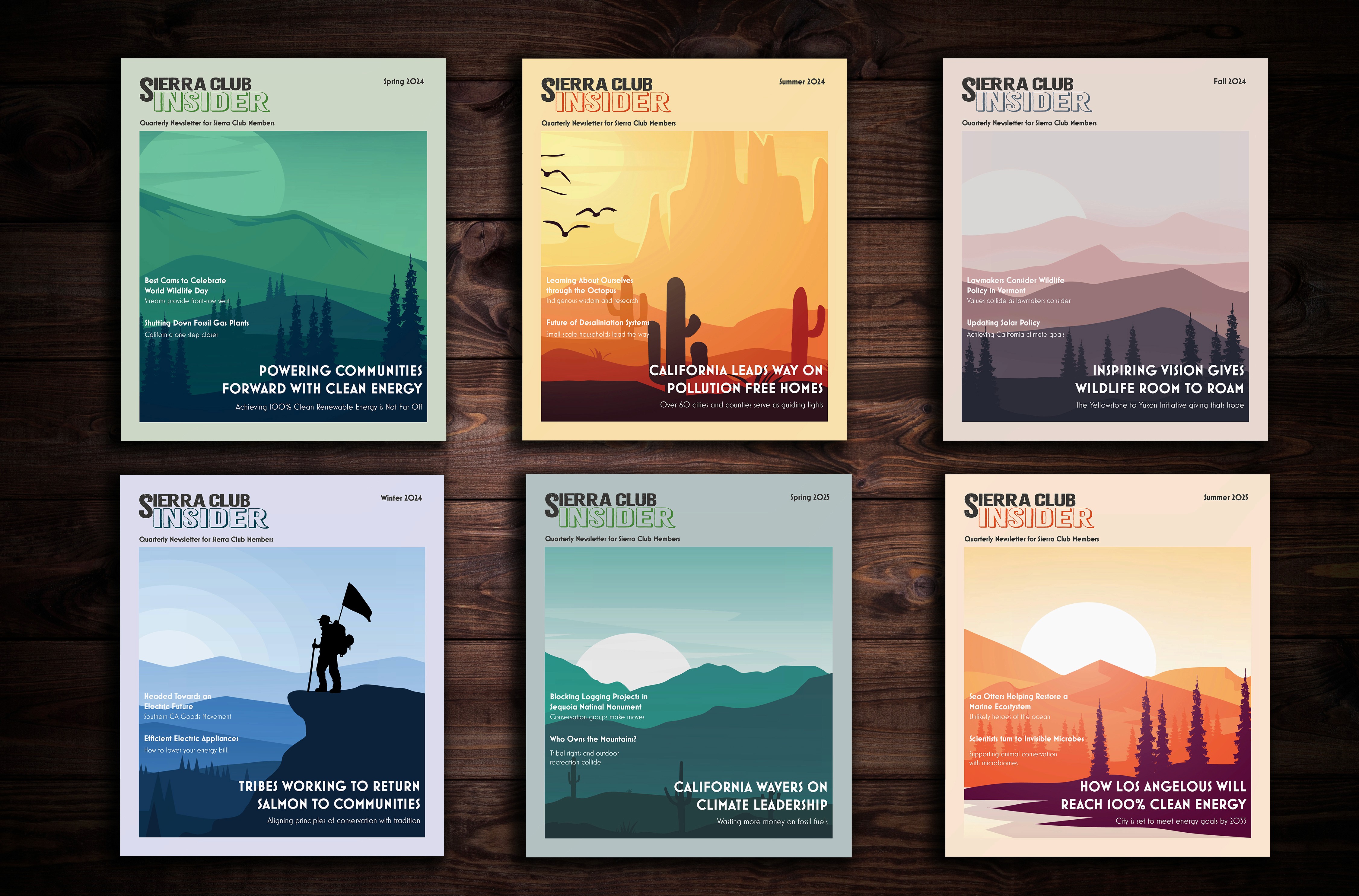
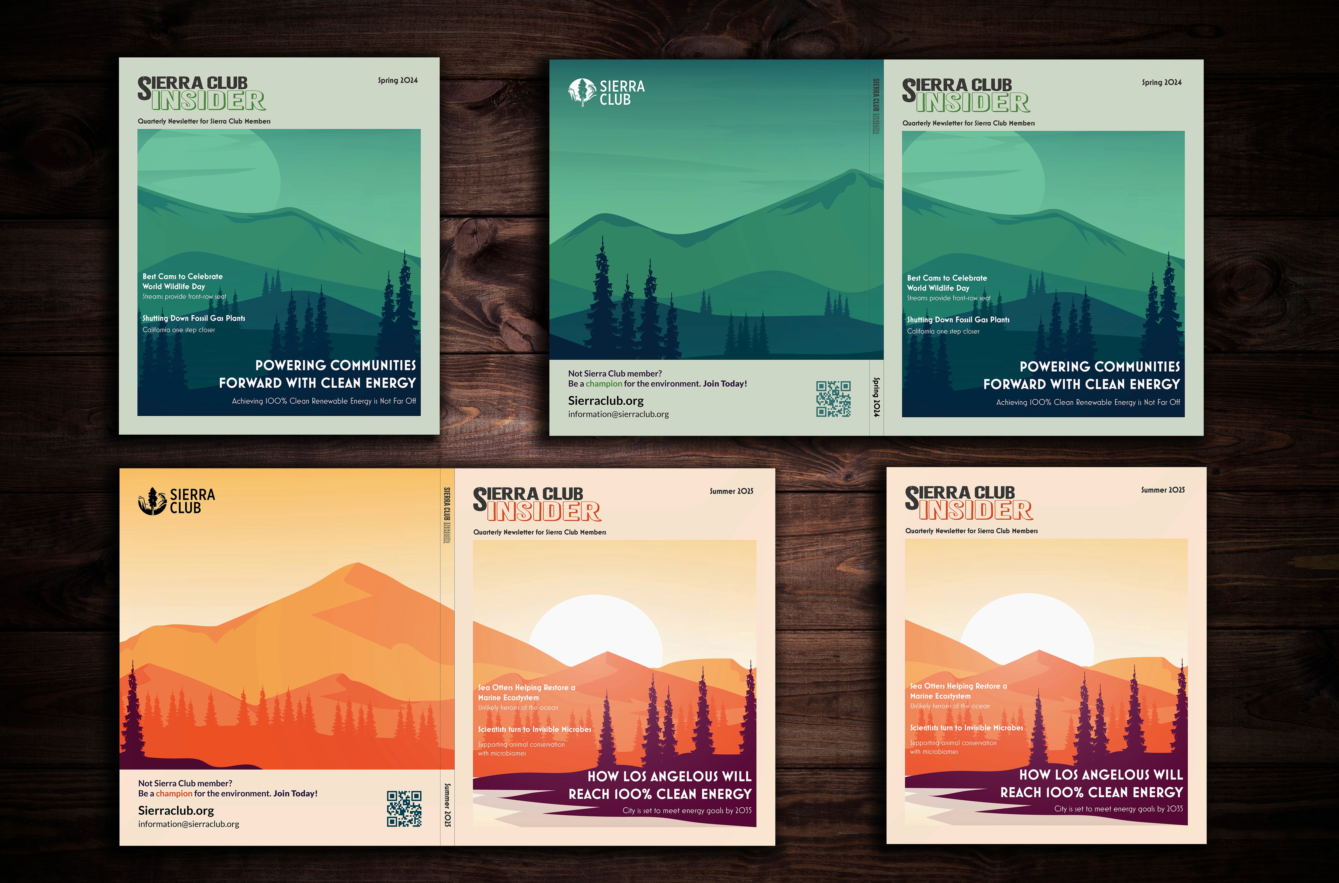
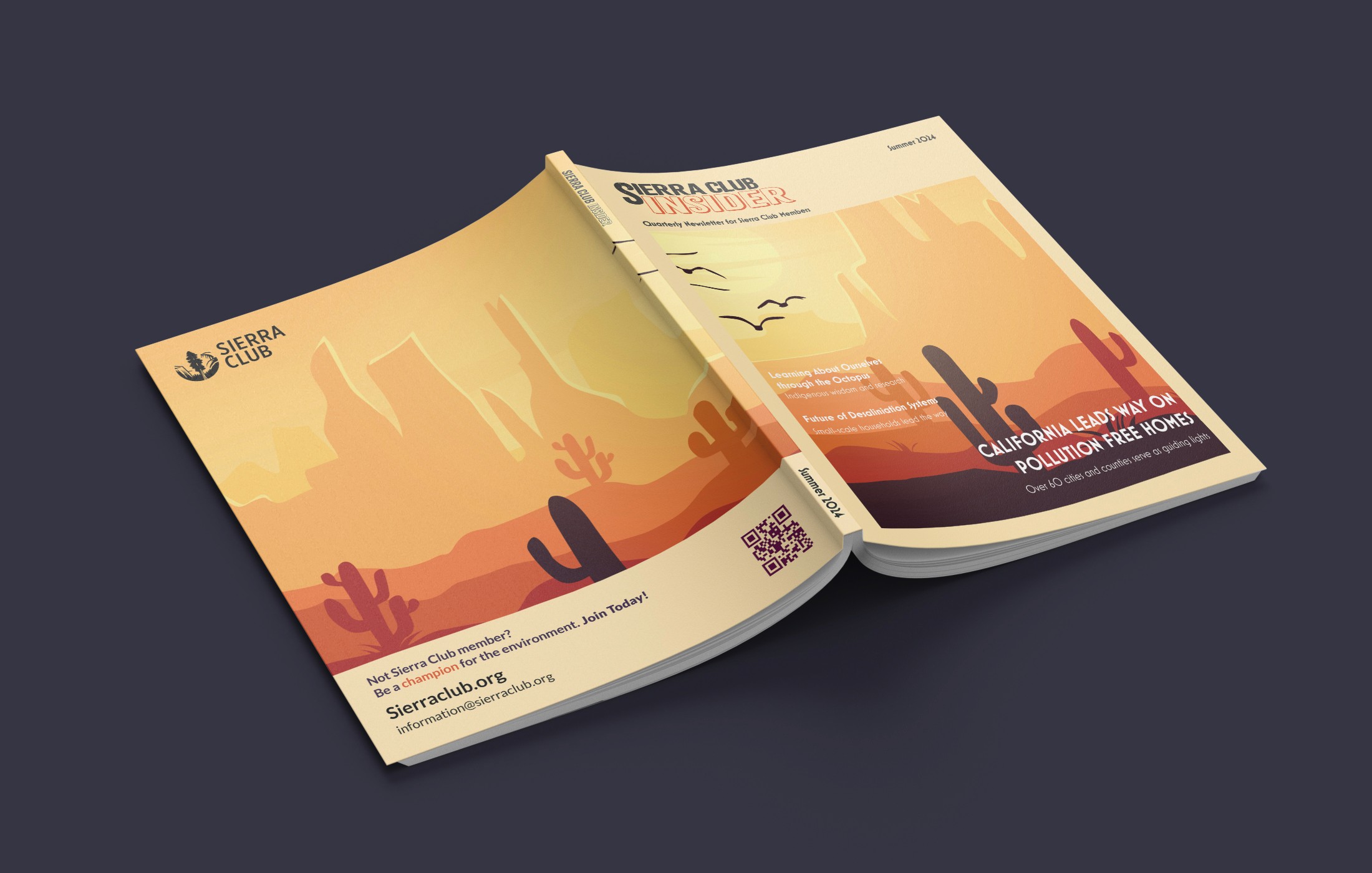
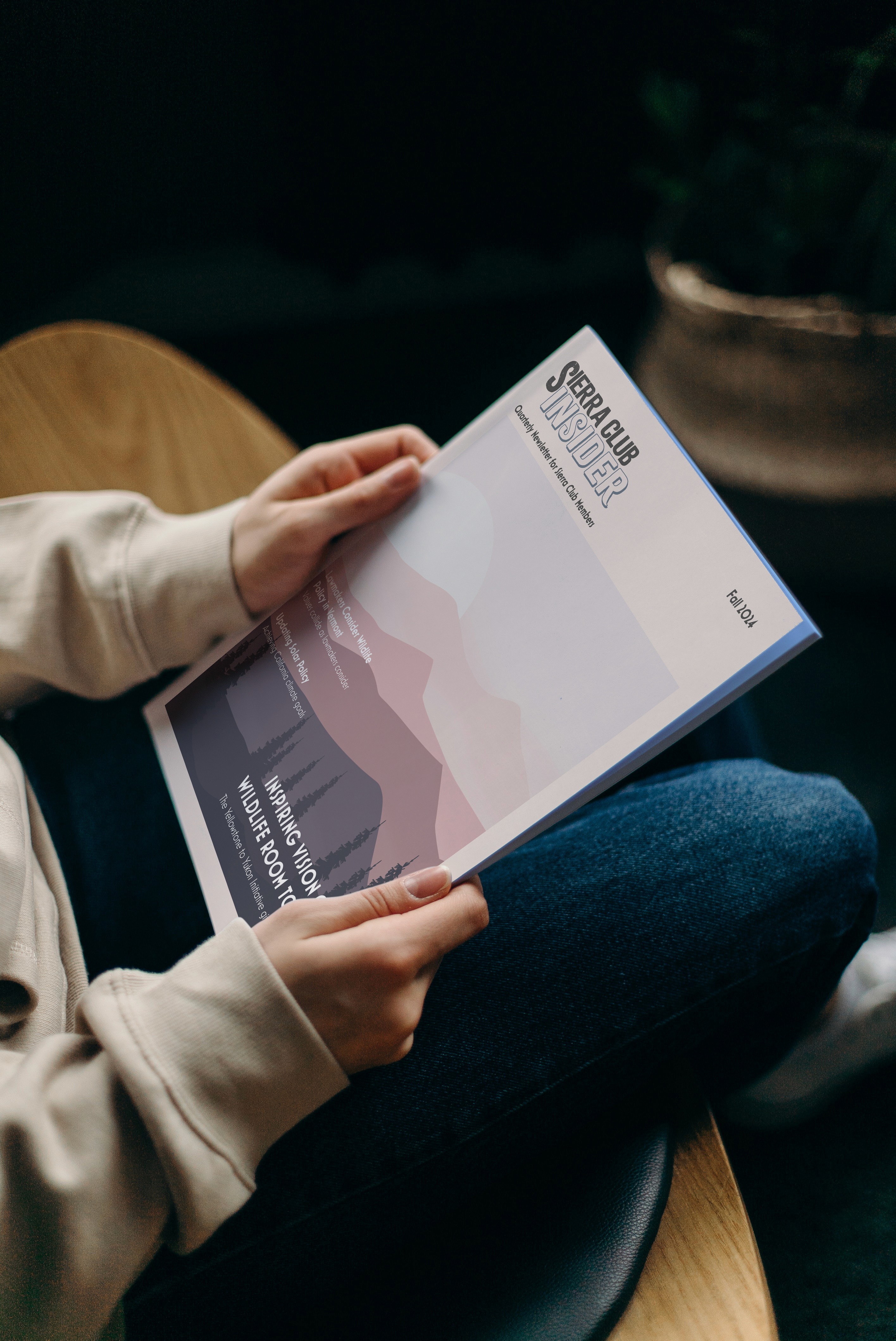
The design for the covers was inspired both by mid-century travel posters and the beauty of the varied nature across the United States. The typeface choices were guided by popular mid-century style forms.
Each issue has it's color scheme based on that quarter's season; spring, summer, winter, and fall. The illustrations must be vector art that is a silhouette landscape with a Sun element for cover page. These illustrations can have people, animals, or plants for the objects in shadow. The illustrations must be large enough to overflow onto back cover. The front cover provides a framing to place article headers and sub headers.
The final vector illustrations chosen for this concept design were found in Adobe Stock and designed by the artist named Amil, with some adjustments made to size or placement of forefront silhouette elements.
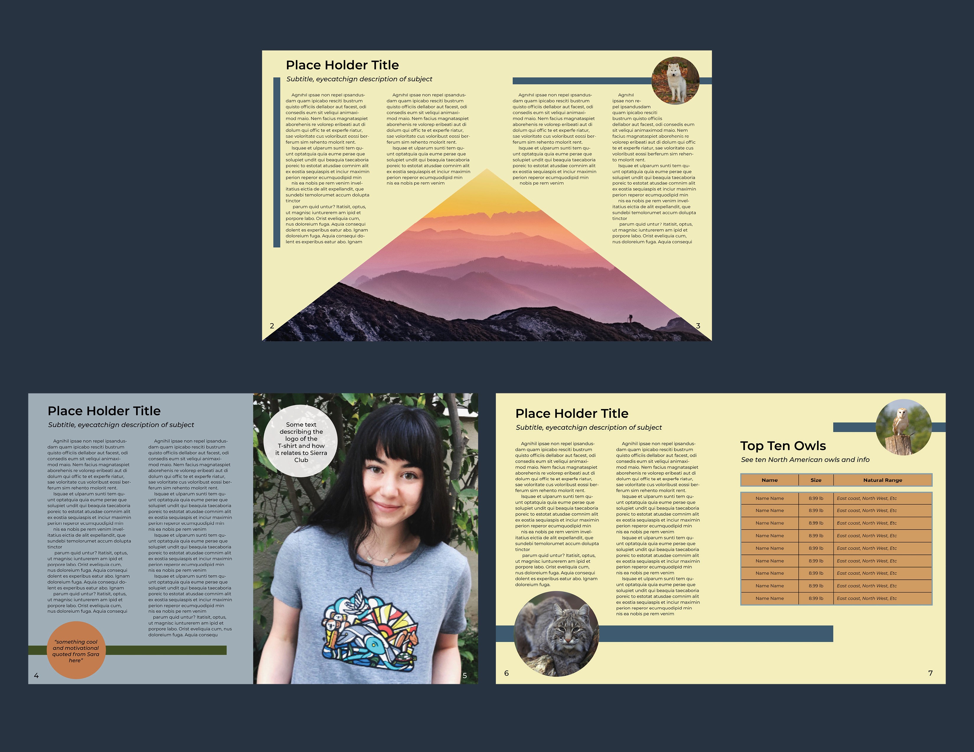
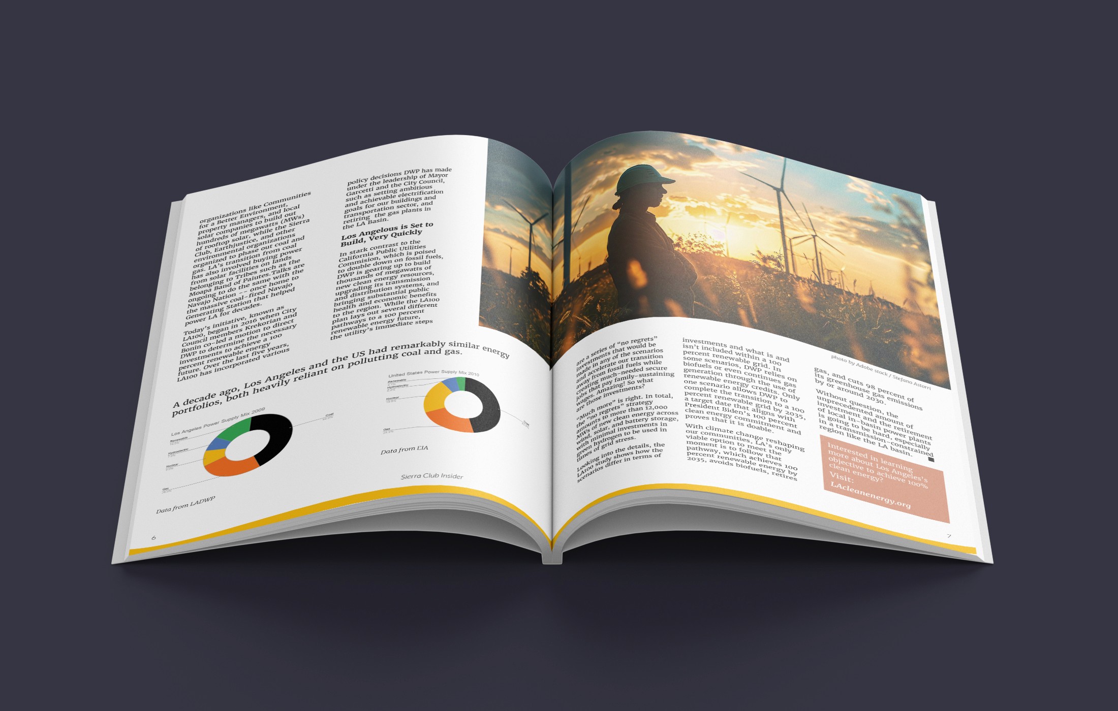
Built on a 10 x 10 grid with .125 inch gutters, the internal spreads feature beautiful photography, illustrative elements, and well organized typography to help take the reader on a journey and keep them engaged. The body text utilized Merriweather family of typefaces and Lato family for headers and subheaders, following along with Sierra Club brand guidelines. Getting to the final designs required some exploration and a few iterations.
Sketching Wireframes
Initial sketches focused on building spreads with ample white space, engaging photographs, and various block and circle elements to stylize.

First Iterations & Style Change
Initial iteration of interior spreads focused on establishing hierarchy of information, stylized circle and rectangle elements, and photographs. After review, these designs needed to be refined and better aligned to a grid. Additionally, it became clear that the shape elements and full color backgrounds were not working. There would be a medium to high volume of text to apply to each page and more space was needed without reducing whitespace.
Final Spreads
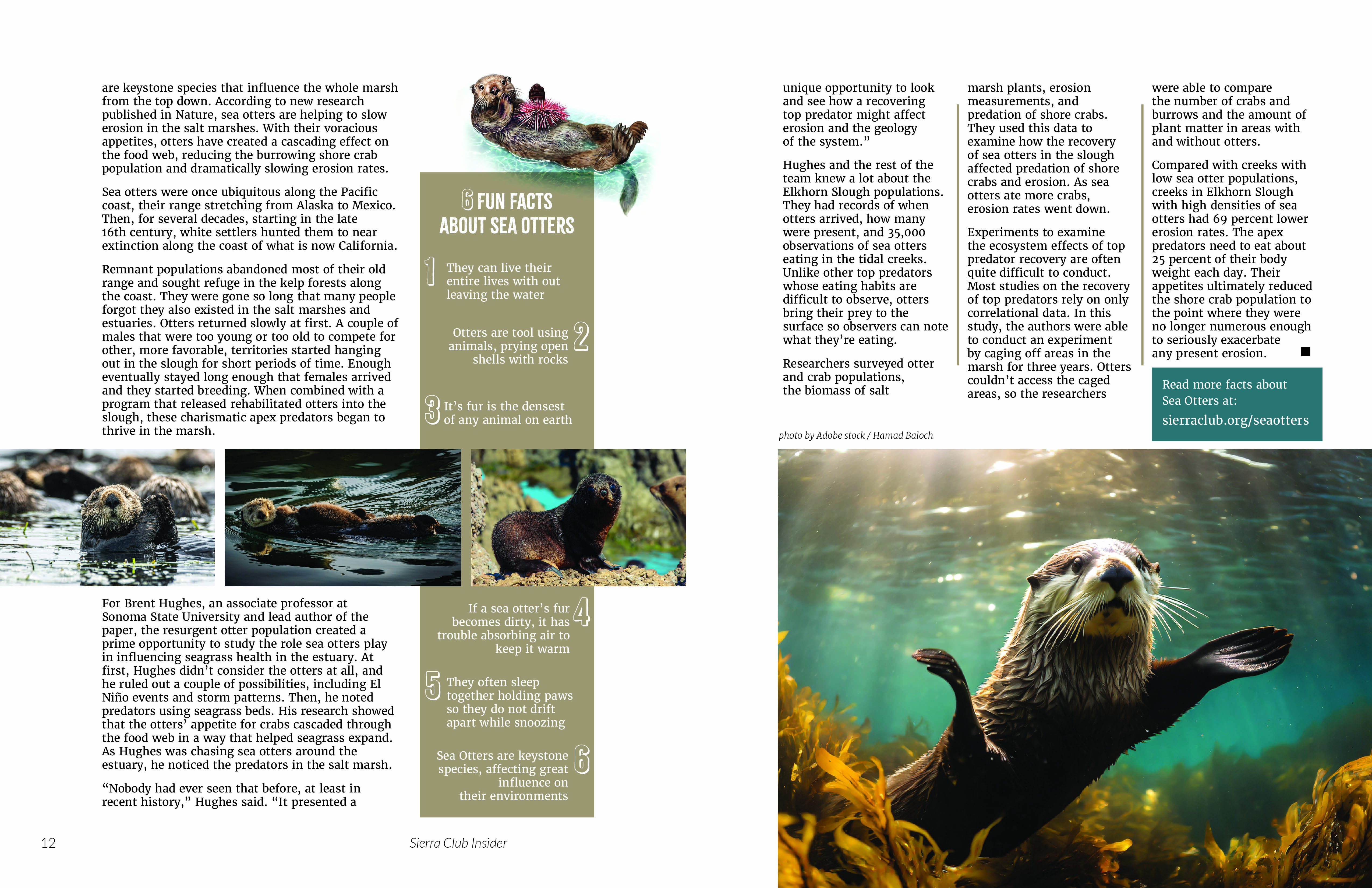
The final iteration of the spreads better adhered to a 10 x 10 column grid and allowed the photographic elements to be shaped and placed in such a way as to provide the engaging elements throughout the pages. Images can be sized or shaped in ways that would guide the journey of the reader. Color background was removed and the article titles were stylized with the sizes of the columns of body text varied to complement the photographic treatments.
*This was a student project
